


I recently had the privilege to work on increasing the transparency of our txstream FinSurv solution. What came out of it is a simple analytics framework which we will be building into V3 of our product but also something that can be implemented using SQL, Excel and PowerQuery in the interim.
I will be sharing the realizations with you in this post because I believe they are the foundations for achieving some valuable outcomes with minimal effort. The value of the analytics framework is in how it organizes the objectives into four distinct areas: Maintaining Control, Remediation, Reconciliation and Compliance. This in turn leads to some valuable outcomes. Transparency is increased throughout the system by bringing the right type of information to the appropriate person. It provides effective and timely feedback about the state of the system. It guides people to the likely next steps once a problem is identified. All of this comes together to cover the various aspects needed for a sustainable FinSurv Reporting System. This is our vision.
The great thing about this framework is that the principles discovered for FinSurv reporting are directly transferable to our txstream product. This could even be the beginning of an Analytics Framework for Regulatory Reporting, irrespective of who the regulator is. This ties in directly with our long term vision at Synthesis for Regulatory Compliance.
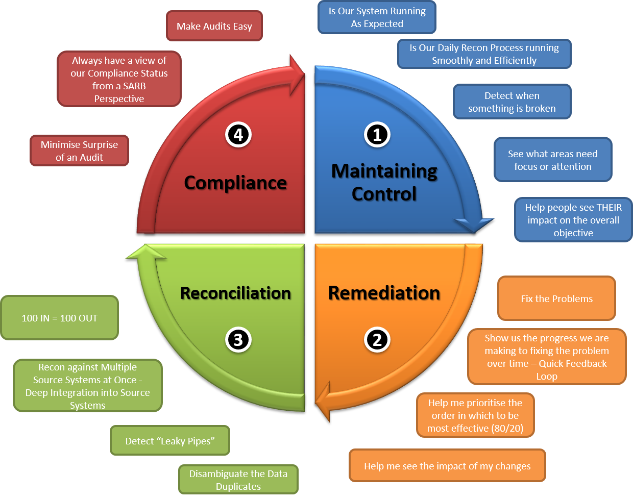
Four Pillars to FinSurv Analytics
A simple, yet effective guiding framework for FinSurv analytics divides the objectives into the following key areas:
- Maintaining Control – Keeping it running and detecting when it is out of control.
- Remediation – Fix it when it is broken.
- Reconciliation – Making sure that 100 In = 100 Out
- Compliance – Always have a view of our compliance status from the regulators point of view.

These pillars can further be broken down into sub-objectives. These give us a more meaningful idea of what is important in each pillar.
Maintaining Control
Is Our System Running as Expected
Here we want a clear and concise view of every part of the reporting process. We want to know whether “business is running as usual“. This includes information about the technical and operational aspects of the system. The SARB requires extensive automation to minimize manual intervention with reporting. This makes it very important to have good operational data to make sure that the automation is running as expected. The feedback cycle time should be low so that if a system goes down then the right people are notified well before the 48 hour limit imposed by the regulator. For areas of the system where manual intervention is required, we want information about the rate at which the work is being done. This way we can intervene from a management perspective with situations where we are likely to get out of control.
Is Our Daily Recon Process Running Smoothly and Efficiently.
The daily reconciliation process can be rather onerous. Having information about the current state of reconciliation makes it evident that the various people throughout the process are maintaining control of the system. Here we want deep integration into the source systems so that automated reconciliation can be done with little or no manual intervention. This is one of the SARB requirements so having clear transparency into the process not only addresses an operational concern but also a compliance concern.
Detect when Something is Broken
We want the system to detect when the system is out of control. It should not only highlight this situation very clearly but it should actively notify the right people that there is something that needs attention. Finding the balance of meaningful notifications and noise is always a challenge here. Having a mobile application with user configurable trigger levels here could go a long way to finding the appropriate level of notification. The interesting thing is that the thresholds for intervention might change over time, either due to seasonality of the transaction data or even as the bank works to improving their own internal compliance levels over time.
See What Areas Need Focus or Attention
Here we want a complete and specific diagram of the reporting process (as a system diagram). It must contain client specific systems that are involved in the process (source systems, automation systems, reporting systems etc…). Key stats on the volumes and rates that each system is processing gives us clear insight into where the source of a problem could be if the stats are outside of expected norms.
The system diagram gives us an immediate view of what the system looks like. Ideally, we want the diagram at different levels of detail. A good system diagram can also help someone new to the team to on-board quickly.
Help People see THEIR Impact on the Overall Objective
There are many individual people involved in the running of regulatory reporting. This makes it very difficult for individual people to get insight into their impact into the overall regulatory reporting objective if all the dashboards and stats are aggregated. Therefore, it is important to have some dashboards that filter the data for the individual looking at it. This gives the individual a personal sense of accountability on the areas that they are responsible for. In a team with high-performing individuals, a good dashboard which makes their contribution clear to the overall team effort can be a great motivator for professionalism and excellence. In a mature team that understands the peaks-and-troughs that people go through, it is understood that the system is not used as a “policing tool” but rather as quick feedback for motivated individuals that want to monitor their personal performance. This objective can be emphasized or down-played depending on the team morale and company culture. I realise that this aspect might not be a motivator in all environments, but my hope is that eventually the organisation might grow in maturity (like the Capability Maturity Model) where this becomes a day to day concern, and we have relevant tools to help individuals already in the box.
Remediation
Fix the Problems
Here we are interested in fixing specific problems once we are out of control. The dashboard should effectively visualize the extent of the problem to be remedied. For example, if our biggest problem is that we have a long backlog of unreported transactions, we need a view of the data over time so that we can see WHEN the problems arose. This is because we find that different problems tend to occur at specific points in time and each problem needs a different method of fixing it.
Quick Feedback Loop
Here we need the system to show us the progress we are making to fixing the problem over time. We want to be able to easily look back at what the dashboard looked like at any point in time previously. This is important for management when working towards achieving an objective by a certain due date. It’s very difficult to snapshot source data so that you can roll back but it is much easier to save the analytics artifacts for easy access later. Something as simple as saving PDF’s of the analyses each day is a start. This gives our system a sense of tangibility. Having concrete artifacts means that people can easily print them out or email them around when other people need to get involved with fixing a problem. Also, with tangible artifacts, we can meaningfully look back at how much work was actually done by the team involved. If the system is able to provide quick feedback with very little effort and leave the individual with something tangible, it makes the system more “Real“.
Help Me Prioritize
Here we want the system to help prioritize the order in which we would be most effective in remediation. We have found that the 80/20 (Pareto Principle) often applies here so an analysis of the data showing the frequency of a certain type of problem naturally leads us to focusing on low-hanging-fruit.
Help Me See the Impact of My Changes
Similar to maintaining control, here we want to show the impact that one individuals fixes have made to the overall target that needs to be remedied. Often it becomes difficult to see this when the data is aggregated to the team level.
Reconciliation
100 In = 100 Out
At its most fundamental, we want to know that 100 reportable transactions coming into the bank will equal 100 transactions reported to the regulator. We have found that there are two levels to this requirement.
- Reconciliation based on counts – Here we only look at the counts of records between systems. We are only interested in the count of records at each leg of the system diagram. This view is more valuable when overlaid on a system diagram and it is better used to determine whether the system is in control or whether we need to remediate data-loss in the system.
- Reconciliation based on individual transactions – Here we do deep integration into the source systems to check that each transaction is actually found in each system (based on the Transaction Reference Number). This is more difficult to achieve technically but it definitely adds the most value because it gives insight into specific gaps in source systems or manual processes. Doing the reconciliation at this level and then aggregating the data to get the counts (point 1 above) is the recommended approach.
Deep Integration into Source Systems
Automation that checks the status of each transaction in all of the source systems provides the most insight into the health of the system if it can be automated. When a discrepancy is found then it usually indicates a problem with a technical system or mistakes in a manual process. Probably the hardest challenge here is overcoming the natural tendency for system owners to allow a different system to query into their data. Actually doing the reconciliation technically is usually simple with the right tool set (here Power Query has proven valuable). The volume of data to be reconciled can become an issue so doing this analysis for a short time horizon is usually necessary.
Detect Leaky Pipes
Here we want a quick and easy way to detect that data is being lost between links in the system diagram. A good way to do this is simple to show the counts of transactions at the beginning and end of each link between systems. We want a concise system diagram that makes it easy to narrow down where the source of leakage might be. Once a leak is detected, we usually want to switch focus to a remediation perspective.
Disambiguate the Data Duplicates
Some systems are designed in a way where duplication of data can occur by mistake or by design. This makes reconciliations difficult. The system should provide some insight into the extent of the problem and also perform analysis using fuzzy matching to assist people to remediate the situation.
Compliance
Make Audits Easy
From time to time the regulator WILL perform an audit of the regulatory reporting system. Instead of just dashboards, here I imagine specific artifacts (like Word Documents and Presentation Packs) that get generated by the system that contain the data typically asked for by the regulator. Imagine the first time the regulator comes, they ask for specific evidence and it just happens to be automatically extracted in the report pack. The regulator can just be referred to the report pack. The second time the regulator comes, they would expect to see the data in the report pack and they would ask for it specifically. Since it is system generated, there would be no requirement for manual intervention to produce the data so it makes audits much easier. My ultimate vision in this area would be where the regulator would go to a different client, and upon hearing that they have our system in place, they would jump directly to the standardized report pack when disputing specific compliance issues.
Always Have a View of Our Compliance Status from a SARB Perspective
Here we want the system to give us a daily up-to-date view of our compliance status. Since the regulator is consistent between clients we expect that a large proportion (>60%) of what they look at is predictable. As we uncover these audit items in the field we can build them back into the product so that our entire client base can benefit from this information. Also, us establishing a more direct relationship with the regulator in this regard would make a lot of sense for all parties involved (the regulator, us – the product vendor, and most importantly the client). Win-Win-Win. I have personally gotten confirmation from representatives of the SARB that they would be open to this. I will definitely be exploring this relationship further with them as a product vendor.
Minimize the Surprise of an Audit
Here we want the system to warn us of areas where we are falling short of our compliance obligations. If this objective is achieved well enough then compliance audits from the regulator should minimise the stress of an audit by the Regulator. The regulator typically requests a level openness and proactivity – and having a system with strong audit capability assists with this requirement and goes a long way with giving both the institution and the regulator confidence in the process.
Dashboards
Good dashboards should mix the concerns from each analytics pillar in order to keep perspective of the overall context. This means that we don’t expect dashboards to only contain analyses from one pillar. Instead we expect a healthy mix depending on who or what the dashboard is for. The value of the analytics framework is in how it separates the concerns conceptually but allows them to be mixed and matched based on the person interacting with the system.
We have found that all analytics pillars are interrelated, therefore it is important to provide a glimpse of the other pillars with each dashboard. Since regulatory reporting is the culmination of many interrelated systems, we find that an event in one part of the system will have an impact on other parts of the system. We find that the way in which that event should be visualized depends on which analytics pillar is our focus.
The emphasis of each pillar will vary by the role, and even the by the specific person. Therefore we need flexibility in the Analytics technology so that blend of information can be tailored to each specific role, or even to each specific individual if they are spanning multiple roles. This is where we as Synthesis have an important part to play with the software solution we develop so that we can make best use of modern-day technologies to enable that flexibility in the field.

Separating Concerns… Clarifying Objectives
The analytics framework comes together into practice when you mix analyses, dashboards, roles and people in a meaningful way. The framework gives us a meaningful structure in which we can communicate our needs. It also guides us through the roles into which responsibilities need to be assigned to people and managed on an ongoing basis. The great part is that it addresses the reality of one person being able to fulfill multiple roles at once and also allowing their roles to change over time. This is an important aspect which makes the framework sustainable, because it takes these real-world aspects into account.
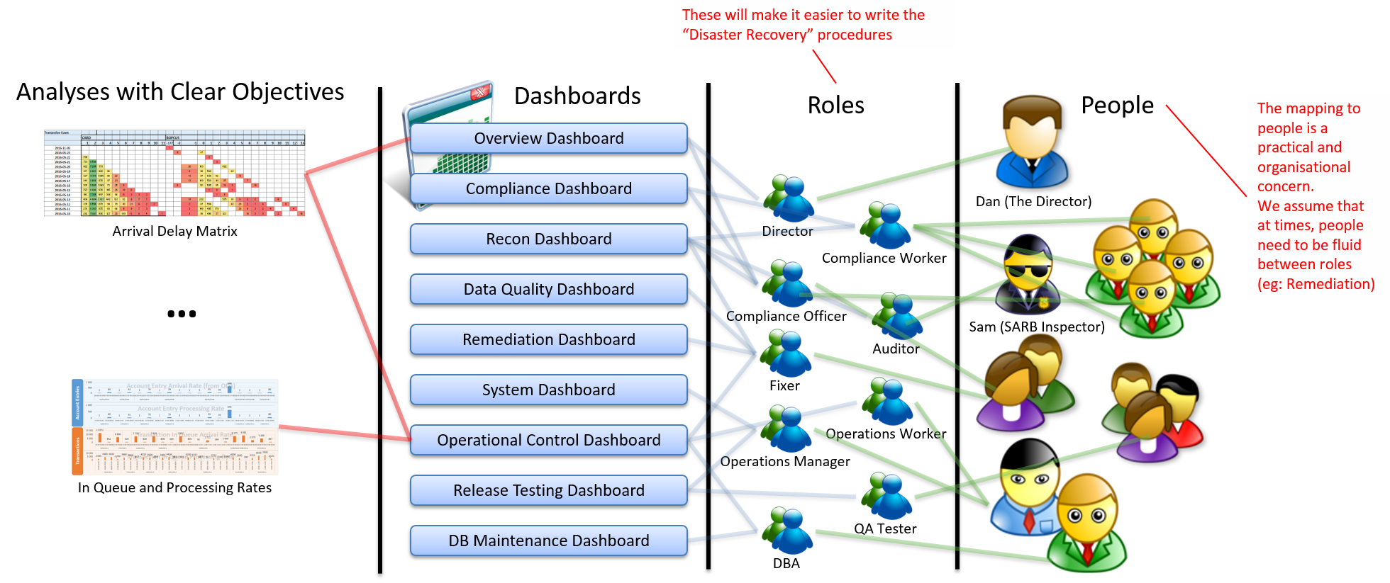
Each analysis is designed to meet specific needs of the pillars. Individual people can perform multiple roles. The dashboards are what tie them all together.
Analyses
Each Analysis is designed to meet specific objectives that tie back to one of the four pillars.
Roles
Roles describe the specific jobs that need to be fulfilled. They also define exactly what is expected of an individual fulfilling the role and how that role interacts with other roles. This definition of roles is very explicit and clear, which can make it very easy to define what somebody joining the team would need to do. This is particularly valuable because it makes it easier to document what needs to be done in a “Disaster Recovery” situation.
People
Individual people in the organisation will from time-to-time fulfill different roles. Although it is easy to imagine that one person will fulfill one role, I have found in practice that this is rarely the case. First of all, when you consider the “bus-factor” problem, you don’t want to have a key-man dependency on a critical business process so you often have a level of redundancy amongst people. When you consider that people go on leave and unexpectedly take sick leave, it makes sense that you need at least two people who are able to fulfill a key role in order to keep the process running. Secondly, people grow in their careers. Often someone starting out with a menial role can work their way up the ranks and you want to have a reporting system that pays respect to these progressions.
Dashboards
Dashboards are the mechanism that binds the other 3 concepts together. A good dashboard should contain a good mix of analyses where 80% are probably focused on one of the four pillars and 20% touch on the other pillars to provide context. This is not a hard and fast rule but rather a guideline. The framework gives us a guide for how to organize our dashboards because it gives us very specific objectives that need to be met. A good dashboard will make it very obvious that it achieves each of the objectives by providing the right type of information at the right level of detail to the right person at the right time.
Here are some examples of dashboards that have been developed using this conceptual framework.
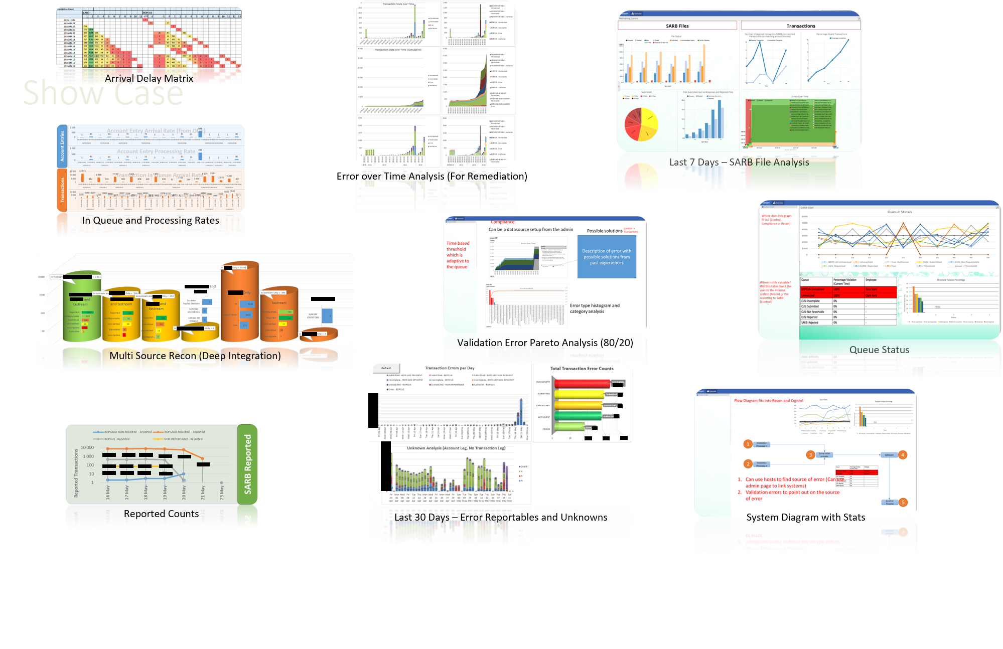
Type 1: Role Based Dashboards
The first type of dashboard is designed around the needs of a role. This makes the dashboard generically applicable to any client because regulatory reporting is extremely well defined irrespective of what environment it is running in. This makes it valuable for us to provide these dashboards “out-of-the-box” with V3 of our product. These role based dashboards are also very valuable for people that occasionally interact with the system or fulfill various roles.
For us as product vendors, having role based dashboards is a great way for us to build valuable learnings from the field back into our product. A technique that proved to be valuable in a certain type of situation can be developed and rolled out to all of our customers that might have a similar need. So far, we have found that all the dashboards we have developed in the field fall cleanly into the pillars of the analytics framework.
Type 2: Person Based Dashboards
Person based dashboards are the most valuable for individuals that work often with the system and fulfill multiple roles. This is especially true as the focus might shift from maintaining control to remediation and back again. Having tailor made dashboards for specific individuals makes it very easy for them to get quick feedback around the parts of the system that they care about and the areas that they might impact.
In order to practically deliver these more valuable person based dashboards, we as product vendors need to have a flexible, yet expressive technology where the individual dashboards can be customized in the field without requiring a change to our code base. Usually this kind of change would be very expensive and time consuming because of all the rigor that needs to be applied to a new release (Dev to QA, QA to Production). If the dashboards are configurable in the live system then we can easily tailor make the specific dashboards in the field. Advanced users are empowered to take ownership of their experience and they can even tweak their own dashboards as their roles shift over time. This significantly decreases the total cost of ownership of our solution and drastically increases the value-add to the people responsible for being part of the regulatory reporting system.
Analysis Levels
Each analysis should clearly address the concerns that ultimately tie back to one of the four pillars of the analytics framework. However, we have found that there are 3 levels of insight that each analysis can fall into. The value of each level increases exponentially as you go from level 0 to level 2.
- Level 0: Raw Data – This is the simplest level to achieve. This level is simply about presenting the raw data. The way in which the data is presented could be polished and refined but it really just is a representation of the data. It takes someone who understands the data and the context of the data to interpret what it means.
- Level 1: Information and Visualization – This level focuses on extracting the information (or pattern) in the data by using various visualization techniques. There is usually some level of post-processing or aggregation to the raw data before the information becomes meaningful. Although a good visualization should get the information across quickly, it is still the case that someone would need to be taught to “read” the visualization before it becomes meaningful to them.
- Level 2: Insight and “So What” – This is the most valuable level. It aims to make the “So What” of the information obvious. It has visual cues to draw attention to how the information should be read. It also incorporates contextual information into the analysis so that the implication of the information is clear. This is where the analysis becomes a decision support tool because the obvious implication is suggested by the analysis (with relevant detail available through drill-down) and the decision on how to interpret the situation is left to the person reading the analysis. Key information that is required to make that decision is presented clearly and the detail is accessible to the person with very little effort if they want to interrogate the data first. For example, a good Level 2 analysis might explicitly say: “The incoming data for today (5 412 transactions) appears to be below the expected amount from the last 2 weeks (7 000 – 10 000 transactions per day). Consider checking whether the automation scripts in the X system ran as scheduled. Contact John for that.”

Conclusion
Although we have gone into some depth into a New Analytics Framework for FinSurv Reporting, it is clear that there are only 4 main areas that ultimately need to be addressed. This framework separates the analytics into Maintaining Control, Remediation, Reconciliation and Compliance. By using dashboards in a flexible technology, we can effectively provide relevant and timely information to the various roles required for regulatory reporting. If the technology is flexible enough to configure in the live system in the field then it means that for specific key individuals we can even configure tailor made analysis that give specific insight into the areas of the system that the individual cares about.
With recent experience in the field, we have proven the relevance of these concepts even with rudimentary tools like Excel. Our vision for V3 of our txstream FinSurv product is designed around the concepts mentioned in this post. I am excited to be able to work on these features and I hope that this framework gives us a common language in which to take the ideas even further. I look forward to your thoughts and comments.